From paper to skin, Becca Jordan’s journey to tattoo artist

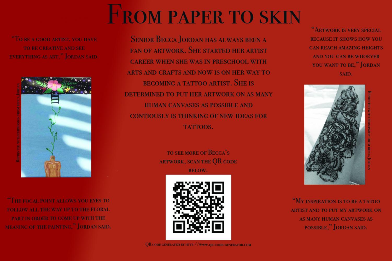
Senior Becca Jordan is learning how to become a tattoo artist, but her goals are far-reaching as she is very creative and wants to put her art on as many bodies as possible. As she explains above, her brain is constantly thinking of new designs and ideas, and it has been that way since she was a preschooler. “To be a good artist, you have to be creative and see everything as art,” Jordan says.
About the Contributor

Logan Huber, Distribution Reporter
Logan Huber is an 11th grader and is a Distribution Reporter and writes for the sports department. He plays school and club soccer and hockey. He spends...


Luke Higgins • Jan 16, 2018 at 1:07 pm
The title is very catchy and intriguing, and how it is all setup and layed out is done well. The only thing is that I was hoping to learn a little more about rebecca and her journey as a tattoo artist.
Mark O'Shea • Dec 19, 2017 at 9:33 pm
Very good title, draws the reader in. There seems to be a lot of space in the article. Maybe some more pictures or the history of Becca. Overall very cool article to write about.
Emma Polucha • Dec 19, 2017 at 8:10 am
I really liked it overall but I think it needs more visuals. There’s a lot of space that could be used for more photos or a graphic to show more information. It is also hard to see the text since the background is a darker color. Otherwise it is really well written and I loved reading it
Abigail Begin • Dec 18, 2017 at 6:08 pm
This is very well done. This is a very interesting topic because it shows the variety of interests in the students. I also really enjoyed all the quotes from her scattered around the page. In my opinion, I would add more color and maybe change the shape of the pictures. Also, I think if more pictures were added it would be a lot more eye catching.
Abby Banks • Dec 18, 2017 at 8:02 am
I really liked this Alt. Copy! I thought colors were strong, there were fun ideas in the layout and with the incorporation of the actual art she does! My one thing would be we need a bit more information on there- it looks a bit bare!
Mira LaNasa • Dec 18, 2017 at 7:54 am
I like the look of this alt copy. It is clean and has good information. The fade in the back is just a little weird, but the colors are nice. The QR code helps aid the reader by a lot.
Hannah Sween • Dec 17, 2017 at 11:27 pm
This is a very cool story! However, the layout of the alternative copy is very simple and lacks a dominant image. I think that if it had a dominant image and things were shifted around a bit it would be much more dynamic.
Kaitlyn Kirby • Dec 17, 2017 at 7:19 pm
I thought the headline had a clever name and It caught my attention right away. The article was organized very well and looked nice. I really liked seeing the artist actually artwork and wished that there were more pictures. I also thought that there were many good quotes that really helped to bring the story altogether and showed the artist personality as well.
Alyssa Bump • Dec 14, 2017 at 5:22 pm
I was drawn to this article for a couple of reasons. The first one is the title it was intriguing and made me want to read the article. Then the bright red was eye catching. Also the layout is done very well and I like that is doesn’t look super crowded and is easy to navigate.
Benjamin Valerius • Dec 8, 2017 at 5:59 pm
I liked the strong quotes and the layout of this alt copy story and would’ve liked to read a main story about her as well! The only thing I would add is possibly to see a picture of her or maybe some more photos on the alt copy!
Paxton Watson • Dec 6, 2017 at 9:55 am
I really enjoyed this. I thought it was a really different and unique story. I also like the added picture of the actual tattoo and some possible designs it really gave me the impression she was good. The organization and flow of the Alt. Copy was really nice and helped my eyes to flow through. I also thought th equotes used were really strong. Good Job!