Girls soccer caps off successful season

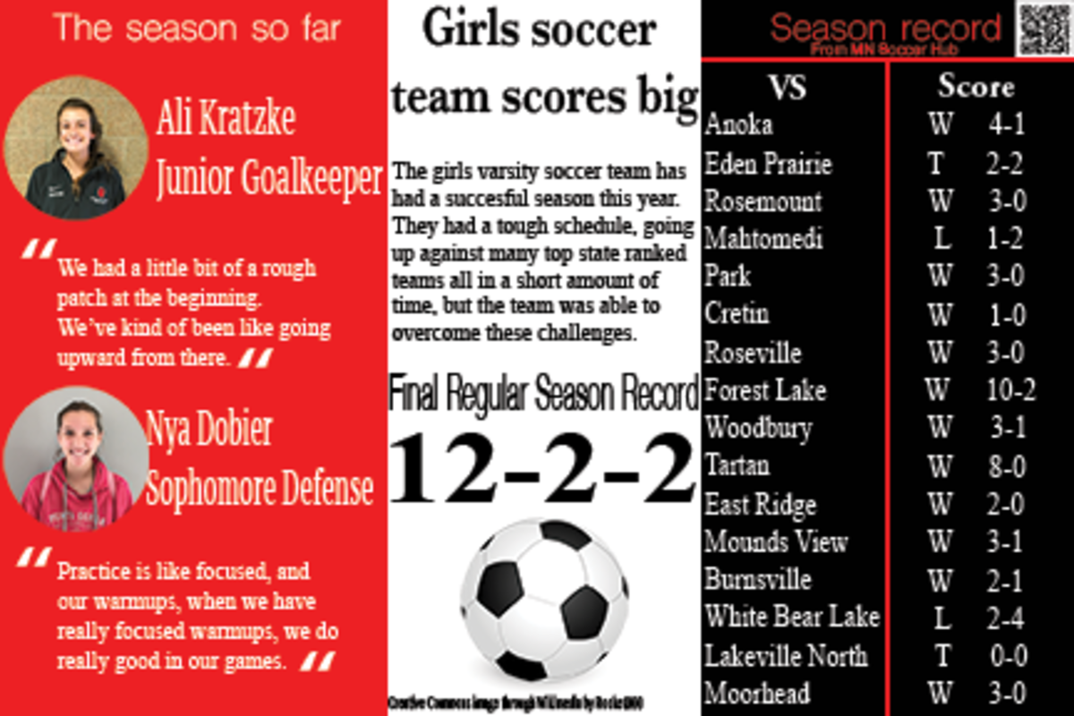
The girls soccer team has concluded a very successful season, spending most of the year ranked in the top ten in the state. A tough schedule made this feat even more impressive.
About the Contributor

Jameson Stahl, Editor-in-Chief
Jameson Stahl is an Online Editor-in-Chief for the Pony Express newspaper. Outside of school he plays lacrosse for the high school and for the Minnesota...


Aubrey Kelley • Nov 13, 2017 at 11:04 pm
This post was very intriguing, the black, white and red stand out and pull the reader in. The writing was clear and informational, however I think the amount of information crowded the overlay and made it look very busy. I really liked how Jameson used the pictures of the players attached with their quote, it put a face with the name and it made it more personal to read. I think if either the font or the organization of this article had been a little neater it would have looked less crowded and much more inviting to read.
Joseph Blomquist • Nov 13, 2017 at 10:24 am
The headline is strong, but there is a lot of information crammed into a small place and looks very crowded, but the content is good
Abby Begin • Nov 12, 2017 at 9:06 pm
I like how neat the overall layout is. I think adding the soccer ball and the pony colors really brought this to another level. The writing is very easy to see and I like how you organized the statics. My only critique would be on the title. It makes it sound as though you are talking about one singular game rather than a whole season so far. I suggest having it include “Girls soccer season”. This is very well done.
Wyatt Wasko • Nov 12, 2017 at 2:54 pm
I was attracted to this Alt story was the creativeness and the ‘pop’ that it had with the pony colors.
I think that the spacing of the text by doing 1/3 for each section made it look very professional.
I think that the best part was showing the full schedule on the right, this allowed readers to see what kind of a schedule the team had to face throughout the season
Jesse Brown • Nov 11, 2017 at 4:18 pm
This article really drew my attention to it. What drew my attention to it was the three different sections of the story each with a different pony color. I liked that the author included their schedule and had the results from it, but it would’ve been helpful to show their schedule in sections and the results from that also, so that readers could know how they finished their season. I thought the article had some good content in it, but I would’ve liked to see some more information about the team and coaches.
Austin Begnaud • Nov 11, 2017 at 2:21 pm
I really like the overall layout of the information with the 1/3 spacing for each section. Having the Stillwater colors as the background color looks really good too. I recommend changing the title of “season so far” to maybe something like “players thoughts on season” or “An inside look on the season.”
Isaac Gunderson • Nov 10, 2017 at 9:02 am
The thing that drew me to this article was the colorful pony colored graphics. I like how you incorporated quotes with stats from the season as well as the chatter.